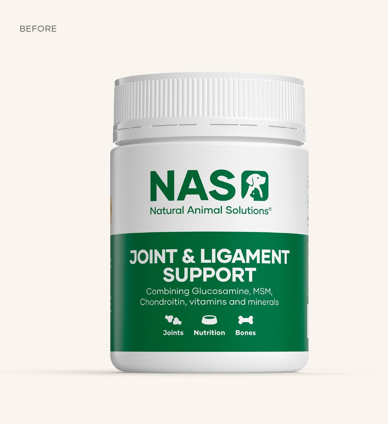
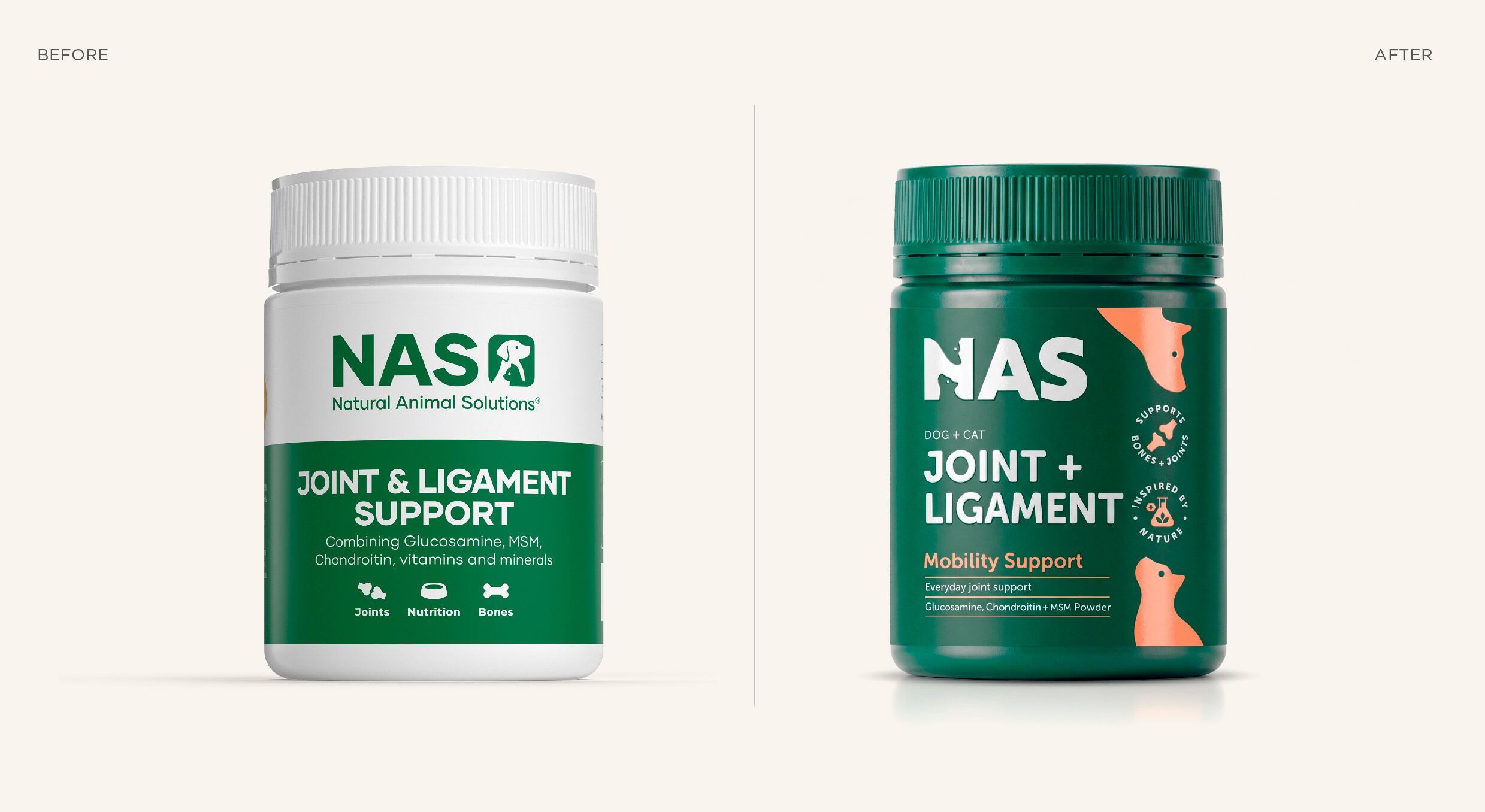
The problem
Natural Animal Solutions had the science — vet-developed formulations, proper R&D credentials and a loyal Petbarn following. But the brand wasn’t doing the science justice. The identity had drifted, different SKUs felt like different brands on shelf, and the sales sheets looked nothing like the packaging. A logo refresh wouldn’t fix it; the whole brand architecture needed rebuilding around a single coherent story.
The insight
Pet-wellness shoppers don’t behave like grocery shoppers. They commit, they research, they cross-check with their vet, and they want the brand to read as serious. That demands consistency across every touchpoint, not just a polished logo. So Morice & Co built one source-of-truth system — identity, range architecture, packaging mechanics, retailer sales tools, consumer education and social — with every piece holding the line.
The design
The work started at the mark, then the colour and type system, then the range hierarchy: SKU naming, ladder logic and visual coding by category. Packaging followed, with front-of-pack and back-of-pack treated as one unified system — a bold, full-colour pack led by a confident NAS wordmark and characterful dog and cat silhouettes. Then everything downstream: retailer sales sheets, the category catalogue, the website, postal boxes, social tiles and lifestyle imagery, each built off the same foundations.
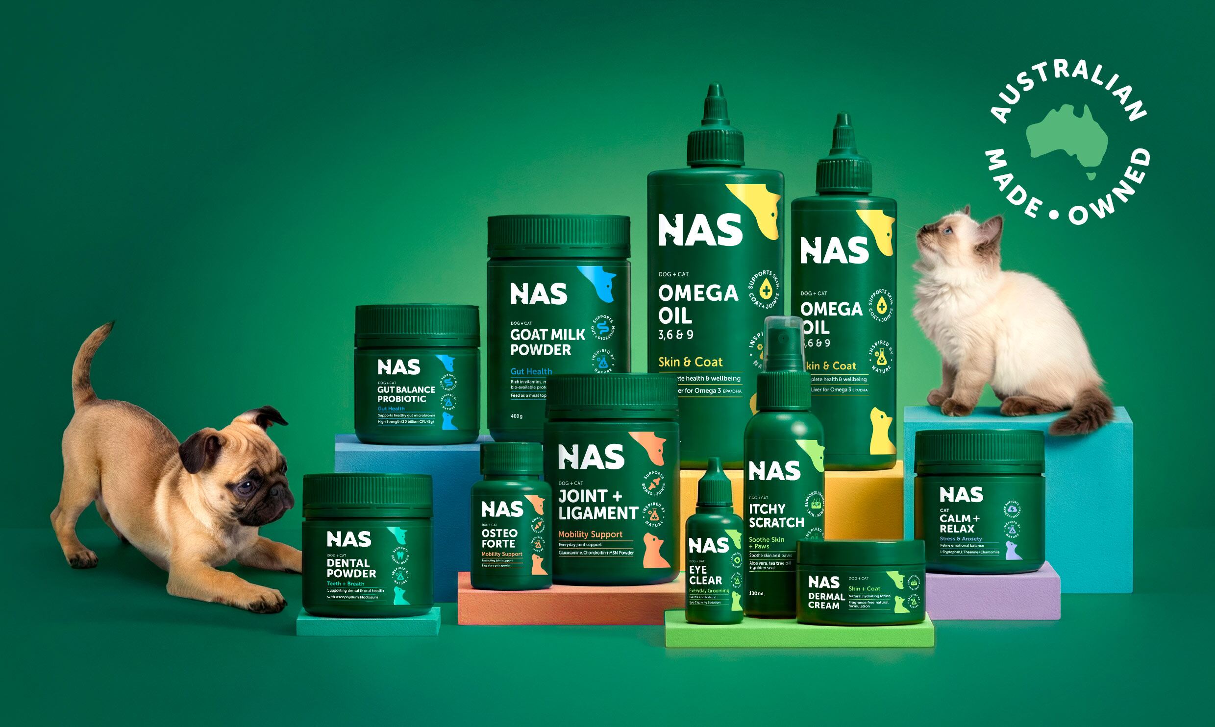
The outcome
The result is a confident, coherent NAS that finally matches the quality of the formulation — one brand across every SKU and every touchpoint, built to hold the line from shelf to sales rep to social.
A Morice & Co project, summarised here as an independent case study. Design transformation shown; we don’t publish third-party commercial figures.