Helga’s is one of Australia’s most-loved bakery brands — ‘generosity in every bite,’ baked into a national following. The Bakehouse Wraps and International Breads ranges needed packaging that pulled its weight on a busy bread aisle and signalled the craft inside the bag. The work: expand the brand’s visual language across two ranges without losing the warmth that made Helga’s a household name. Created in collaboration with Barker Brand Partners.
The challenge — stretch the brand without breaking it
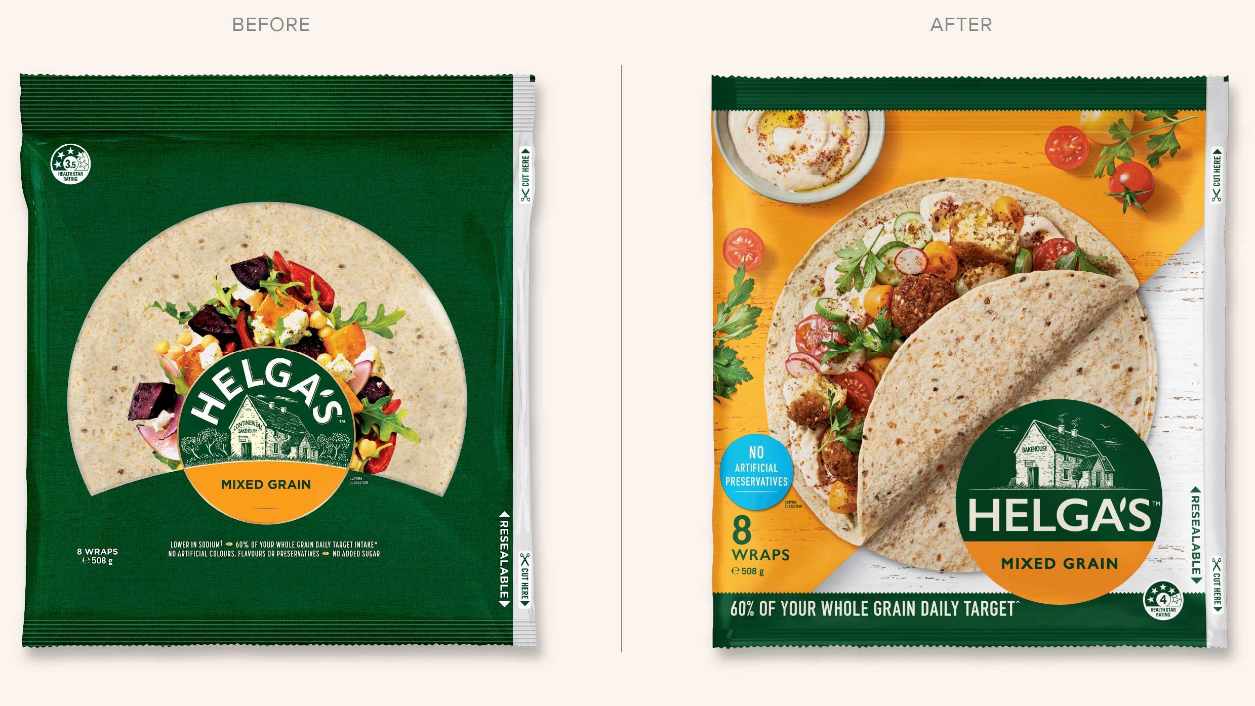
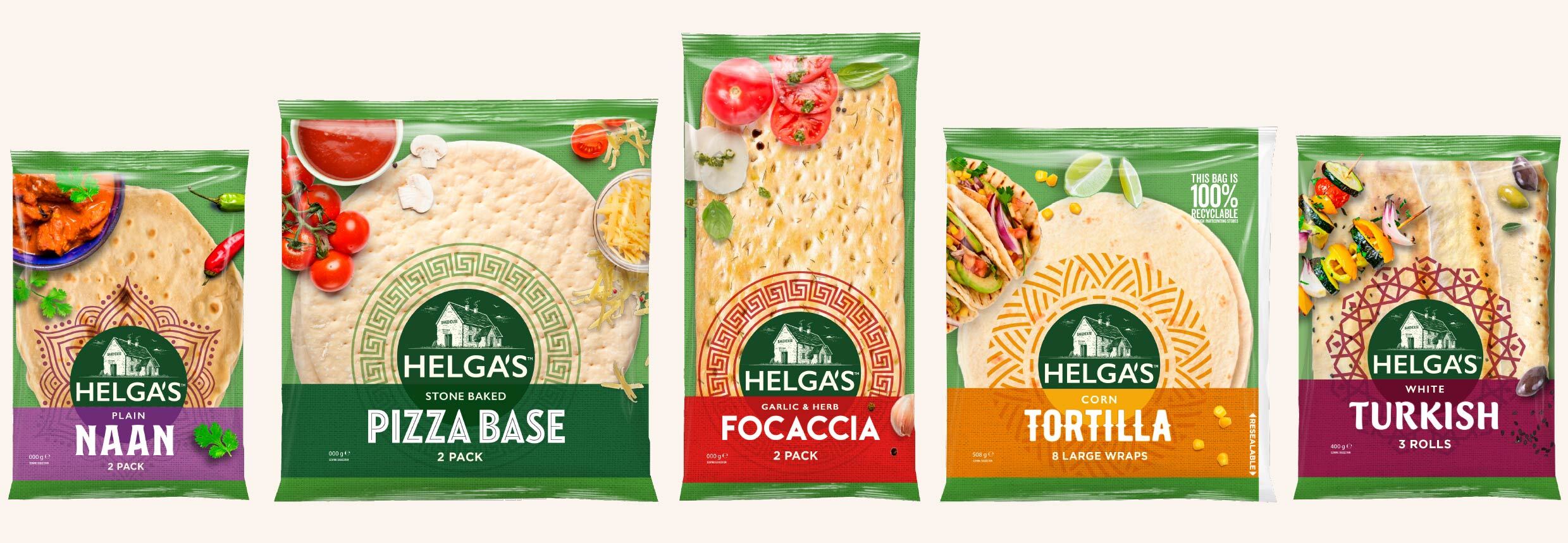
Helga’s lives or dies on shelf recognition — shoppers find it in seconds, in a busy aisle, often on autopilot. The Bakehouse Wraps and International Breads ranges had to earn their own space inside that recognition: distinct enough to be picked up, familiar enough to stay Helga’s, and strong enough on shelf to convert curiosity into a second pack.
The insight — codify the bakehouse
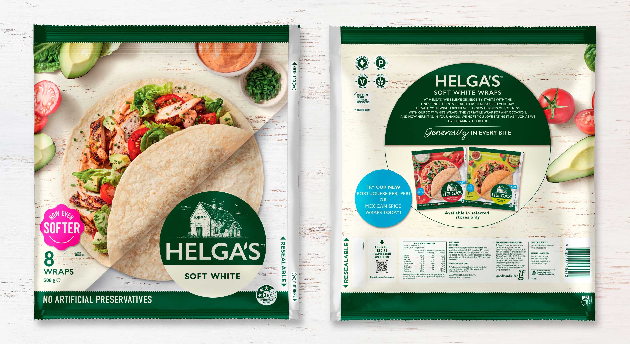
Morice & Co treated the bakehouse as the brand’s quiet hero — the proof the product is made with care, every day, by people who care — and translated it into a system the shopper could feel before they could name it: warmer typography, more confident photography, bread that looked like bread rather than a marketing image. Every pack designed to read at speed, then reward a second look.
“Loved brands don’t reinvent. They earn the right to expand. The Bakehouse Wraps and International Breads ranges gave Helga’s two new shelves to own, without ever asking the shopper to relearn the brand they already trust.”
The outcome
The result is two new ranges that read instantly as Helga’s while earning their own space on shelf — given room to grow without asking shoppers to relearn the brand they already trust.
A Morice & Co project, created in collaboration with Barker Brand Partners. This study shows the design transformation; we don’t publish third-party commercial figures.