Australian Glow had a confident product and a loyal following. The brief: make the brand work harder on shelf — packaging distinctive enough to read across Priceline, Myer, Big W and Amazon, a range deep enough to earn a proper planogram section, and an identity that stopped imitating premium beauty and started owning its actual category. None of that came out of a self-tan playbook.
The challenge — mass beauty without the mass-beauty look
Self-tan lives in a category that always looks the same: polished bottles, restrained typography, tasteful gradients. The category code says premium; the shopper sees same. Australian Glow had a sharp point of view and a product that delivered — what it needed was an identity that looked nothing like the rest of the bay, a range deep enough to earn proper facings, and packaging confident enough to be picked up at three metres in Priceline, Myer or Big W.
The insight — don’t dress like the category, own the product promise
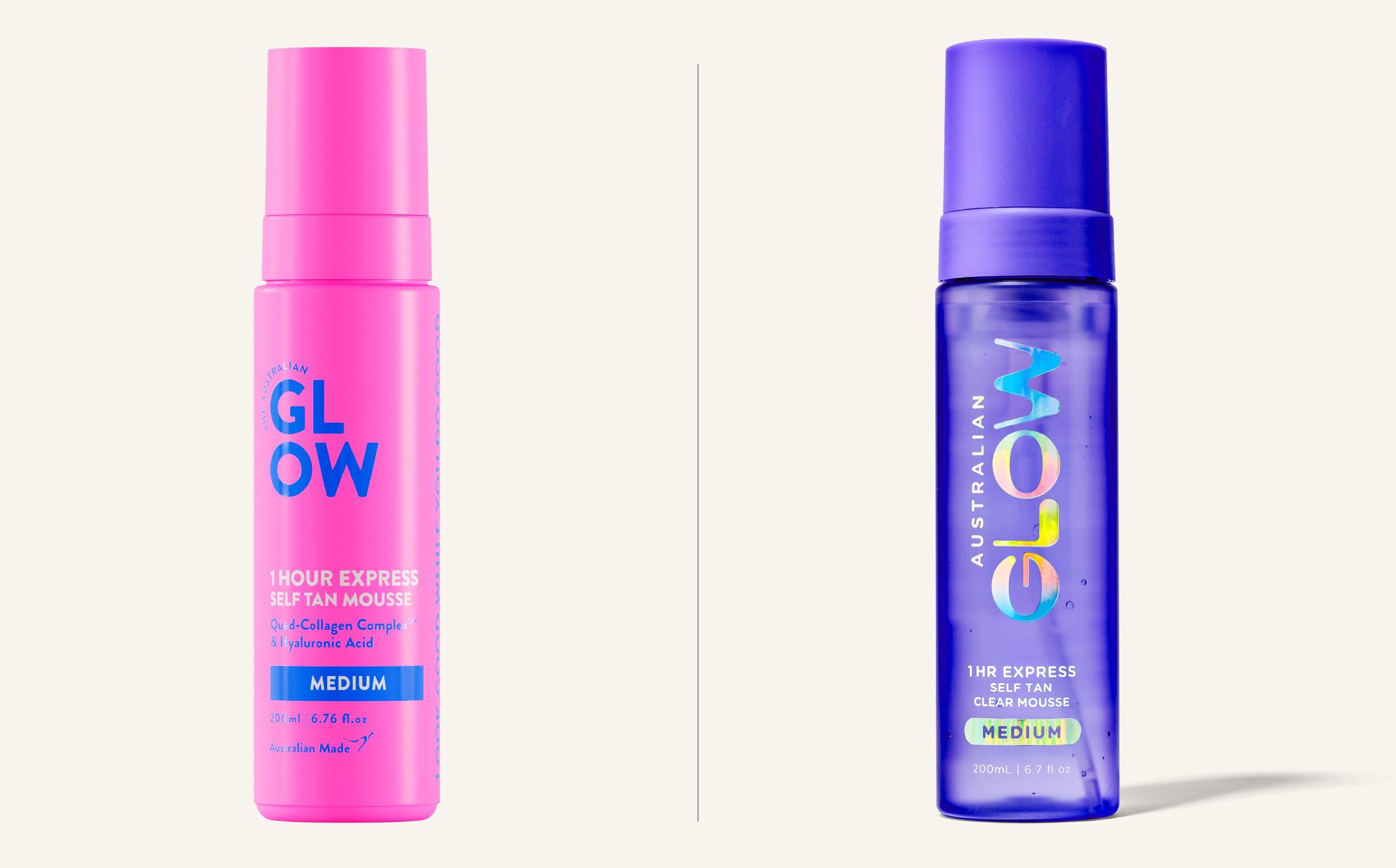
Most self-tan brands sell aspiration: the lit-from-within face, the polished pump bottle. Morice & Co did the opposite. The promise of an Australian glow isn’t aspirational — it’s everyday, sun-kissed, unapologetic. So the system was built around that: distinctive bottle architecture per SKU, in chrome, cobalt and cyan, each one signalling its role before the shopper picks it up. The brand stopped imitating beauty and started owning its actual category.
The process — build the range, not just the hero
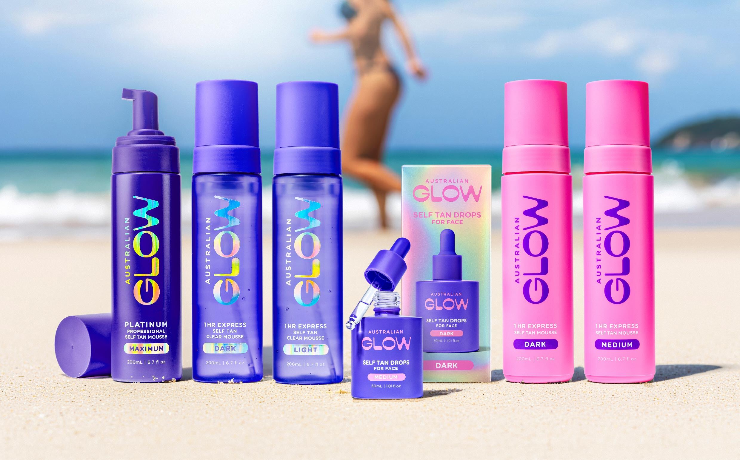
The hero SKU sells the brand to the first-time shopper; the range keeps her there. Six products were architected, each owning a clear role: 1Hr Express, Express Clear, Face Tan Drops, Platinum Maximum, Gradual Moisturiser and the Blend & Slay Mitt. Same brand, different mechanics, different speed-to-glow — enough depth that Priceline, Myer and Big W planograms could allocate a proper section instead of a single facing, and enough distinctiveness that the brand never reads the same as anything beside it.
“Self-tan didn’t need another premium imitation. It needed a brand confident enough to look different. The range did the heavy lifting on shelf. The identity did the heavy lifting in the shopper’s memory.”
The outcome
The result is a self-tan brand that looks nothing like the bay it sits in — colour-coded bottle architecture, a range built to earn its own planogram section, and an identity that does the heavy lifting in the shopper’s memory.
A Morice & Co project. This study shows the design transformation; we don’t publish third-party commercial figures.